
September 18, 2025
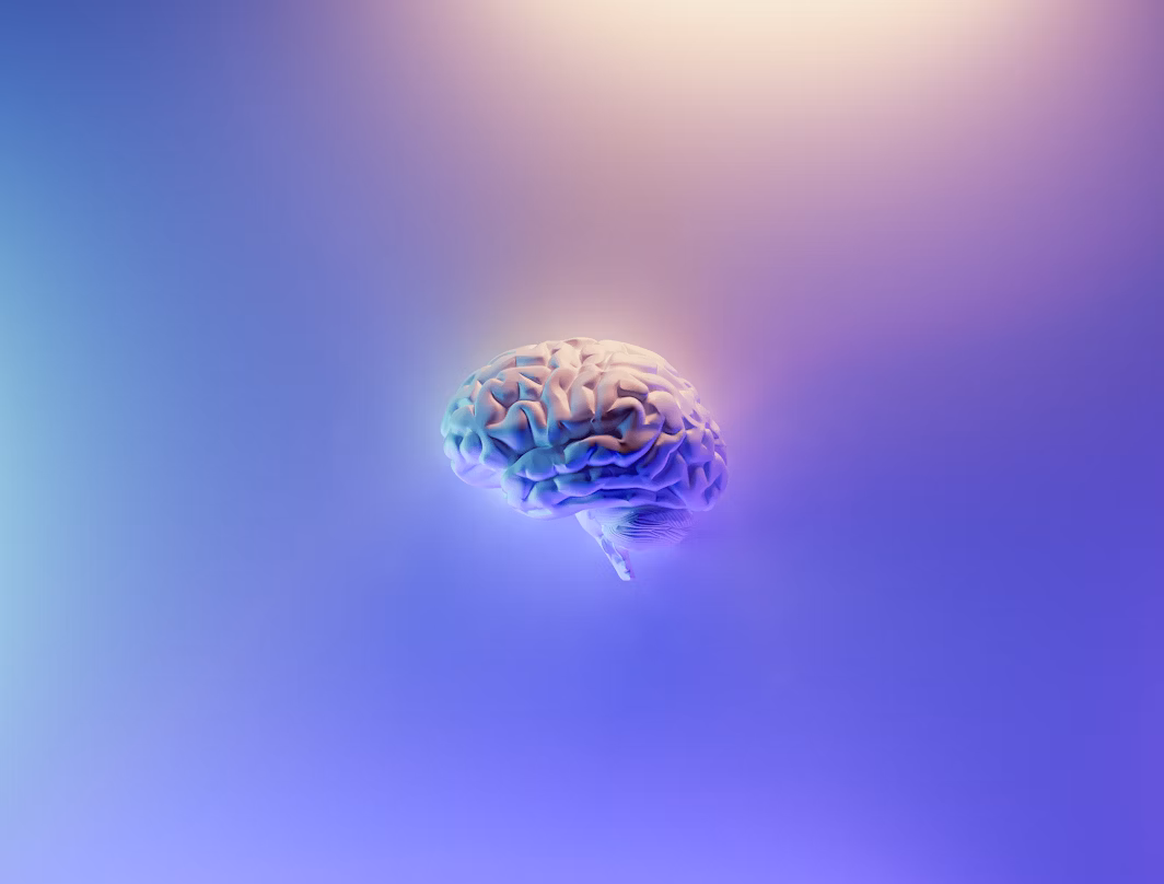
Here's a depressing truth: your brain is actively working against every brilliant brand decision you make.
Psychologists call it the mere exposure effect. We prefer things we've seen before. This explains why your uncle still thinks the best logo is Times New Roman in black and white, and why every startup pitch deck looks identical. Our brains are fundamentally lazy creatures. They want the familiar, the safe, the already-done-a-thousand-times.
This bias runs deeper than just aesthetic preferences. When we see something new, our brain has to work harder to process it. That extra effort feels uncomfortable, so we default to rejecting it. It's why most people's first reaction to bold design work is often negative. It's why committees love watering down creative concepts until they're unrecognizable. It's why playing it safe feels so appealing.
But here's where it gets interesting. The brands we actually remember and love are the ones that managed to sneak past our brain's security system. They found that sweet spot between familiar enough to not terrify us and different enough to stick in our heads.
Take Apple's first logo from the 1970s. That rainbow-colored apple with Newton sitting underneath broke every design rule and looked nothing like other tech companies of the time. IBM had their solid blue letters. Xerox went with straightforward corporate typography. Apple chose a literal fruit with a scientist. It should have been a disaster.
But it worked because it borrowed familiar symbols while putting them in completely unexpected contexts. Apples represent knowledge and learning. Rainbows suggest optimism and creativity. Newton symbolizes innovation and thinking differently. The logo felt both revolutionary and somehow right.
The same principle applies to more recent success stories. When Airbnb launched their controversial logo redesign, the design community had a collective meltdown. People called it everything from inappropriate to downright offensive. Yet it worked because it took familiar concepts like belonging and home and expressed them in an unfamiliar visual language.
The trick isn't to fight your brain's tendency toward the familiar. It's to hack it. Use recognizable elements in unexpected ways. Borrow visual languages from adjacent industries. Make the strange feel familiar and the familiar feel strange. This is why luxury fashion brands can get away with avant-garde campaigns while banks cannot. Context matters.
Your brain will resist bold creative work. That's actually a good sign. If your internal committee isn't feeling mildly uncomfortable, you're probably not pushing far enough. The goal isn't to create something your brain loves immediately. It's to create something it cannot forget.
Remember this when you're reviewing creative concepts. That initial discomfort you feel might not be because the work is bad. It might be because the work is doing its job. Comfort is the enemy of memorable. Safe is the enemy of distinctive. Your brain's resistance might be the first sign that you're onto something special.
Shaping Visionary Brands.


© 2025 PLTFRM Studio LLP. All Rights Reserved.
Built By
Team PLTFRM